
Bedroom Color Schemes for Creating a Calm and Stylish Space
Choosing the right bedroom color scheme significantly affects the room’s mood and overall comfort. Colors can create a sense of calm, warmth, or energy, depending on the shades selected. The best bedroom color schemes balance personal style with the atmosphere desired, using combinations that promote rest and relaxation while reflecting individual taste.

Many successful palettes lean towards neutrals like soft grays, beige, and white for a soothing feel but adding bold accents can inject personality without overwhelming the space. Understanding how colors influence emotions helps guide choices that shape the bedroom into a peaceful retreat or a vibrant sanctuary.
By exploring a variety of color combinations—from timeless neutrals to rich, dramatic hues—one can create an inviting environment that enhances both style and well-being. This approach ensures the bedroom not only looks good but also feels right every time someone walks in.
What Are Bedroom Color Schemes?

Bedroom color schemes involve selecting specific colors and combinations that define the overall look and atmosphere of a bedroom. These schemes influence not only aesthetics but also how the space feels emotionally and functionally. Understanding color psychology and the essential components of a color scheme helps in creating a cohesive and personalized bedroom environment.
Definition and Purpose
A bedroom color scheme is a planned arrangement of colors used throughout the room. It includes paint colors on the walls, furniture finishes, textiles like bedding and curtains, and accessories. The purpose is to create a visually unified space that reflects personal style while supporting the room’s function as a restful retreat.
Choosing the right color scheme sets the tone and mood for the bedroom. It can make the space appear larger, cozier, brighter, or more serene. A well-thought-out scheme helps coordinate all elements of the room, avoiding clash and promoting harmony.
Color Psychology in Bedrooms
Colors impact mood and behavior, making color psychology a key consideration in bedroom design. Soft, muted colors like blues and greens tend to have calming effects, promoting relaxation and better sleep. Warm colors such as terra cotta or muted yellows can evoke comfort and warmth without overstimulation.
Bold shades like deep navy or emerald green are often used to add drama and personality but should be balanced with neutrals to prevent the space from feeling overwhelming. Light, neutral tones tend to make bedrooms feel airy and spacious, enhancing tranquility.
Colors also influence perceived temperature; cool tones can make a room feel cooler, suitable for warm climates, while warm colors add coziness in colder environments. Selecting colors aligned with the desired emotional and physical effect is vital.
Core Elements of a Color Scheme
A bedroom color scheme consists of three main elements: primary, secondary, and accent colors.
- Primary colors cover the largest areas, typically walls or large furniture pieces.
- Secondary colors complement the primary tones and appear in smaller furniture or textiles.
- Accent colors provide pops of contrast and interest through accessories like pillows, rugs, or art.
These elements work together to balance and unify the space. Usually, a limited palette of two to four colors is recommended to avoid visual clutter. The proper combination enhances comfort, style, and coherence, ensuring the bedroom suits its purpose as a peaceful retreat.
Popular Bedroom Color Scheme Ideas

Bedroom color schemes can greatly influence the room’s ambiance and comfort. Some palettes focus on muted, classic tones that promote relaxation, while others embrace striking contrasts or gentle hues to create distinct moods and styles.
Neutral Bedroom Color Schemes
Neutral schemes rely on soft, understated colors such as cream, crisp white, and shades of beige or gray. These tones build a calm, timeless environment that balances warmth and simplicity.
Adding accents like burnt orange or black can introduce subtle depth without overwhelming the space. This approach often features layered textures, such as linen bedding or wood furniture, to maintain interest while keeping the palette restrained.
Neutral colors also adapt well to changing decor trends, making them practical. They create a versatile background for accessories in colors like rose or lavender, which can be rotated seasonally.
Bold and Vibrant Combinations
Bold schemes use rich, saturated shades to energize the bedroom. Combining colors like turquoise, yellow, or burnt orange with darker tones such as black helps craft a dramatic and lively atmosphere.
These schemes suit individuals who want their bedroom to feel dynamic and full of personality. Balance is essential; for instance, pairing vibrant walls with neutral furniture or vice versa prevents the room from feeling cluttered.
Designers often recommend choosing one dominant bold color and supporting it with complementary shades to avoid visual chaos. This method keeps the scheme coherent while allowing expressive color use.
Soft Pastel Palettes
Soft pastel colors like dusty pink, lavender, and pale turquoise create an airy, soothing environment ideal for rest. These hues offer subtle color without overpowering the senses.
Pastel schemes work well with light, natural materials like cotton or wood, enhancing the tranquil feel. Including soft whites and creams can brighten the space further while maintaining a gentle overall impression.
These palettes are versatile, fitting both modern and vintage bedroom styles. They appeal to those who prefer understated elegance and a calm, inviting space.
Timeless Neutrals and Natural Palettes

Neutral and natural tones create a cohesive, calming environment in the bedroom. These shades work well with a range of textures and materials, offering both flexibility and enduring appeal. They emphasize simplicity while providing depth through soft contrasts and organic elements.
Cream and Soft Gray Pairings
Cream and soft gray blend seamlessly to deliver a tranquil, elegant atmosphere. Creamy white walls combined with soft gray textiles, such as linen bedspreads or curtains, create a subtle contrast that feels warm yet refined. This mix balances cool and warm undertones, making it easy to layer additional colors or metallic accents without clashing.
Soft gray often serves as the grounding hue, particularly in furniture or area rugs, while cream softens the palette, adding an inviting glow. This duo supports natural light, enhancing the bedroom’s brightness without overwhelming the senses. It suits both cozy and minimalist styles, perfect for those who want calm without monotony.
White and Wood Accents
Pairing pure white with natural wood tones emphasizes freshness and organic comfort. White walls and bedding provide a clean, crisp backdrop that enhances the texture and richness of wood elements like bed frames, nightstands, or flooring. Natural wood introduces warmth and an earthy quality, establishing a peaceful, grounded feel.
This combination benefits from the contrast between bright white and the various shades of wood, from light oak to walnut. Linen accessories or soft throws complement these tones while adding tactile interest. The overall effect is a balanced space, harmonizing modern clarity with nature’s warmth.
Mink and Pewter Tones
Mink and pewter deliver a sophisticated alternative within the neutral spectrum. Mink—a warm, muted taupe—brings depth without heaviness, while pewter offers a cooler, metallic gray that can highlight architectural features or accent pieces.
Used together, these shades create a layered look suitable for bedrooms seeking a refined, timeless quality. Linen upholstery or cushions in mink contrast gently with pewter lamps or frames, providing subtle dimension. This pairing works well in rooms with ample natural light, allowing the colors to reveal their nuanced textures and undertones.
Inviting Warm Color Schemes

Warm color schemes create a sense of comfort and ease in a bedroom by incorporating tones that naturally evoke warmth and light. These schemes often combine bright, soft, and rich colors that maintain an inviting atmosphere without overwhelming the space.
Sunny Yellow Highlights
Sunny yellow brings brightness and energy to a bedroom without feeling harsh. It works well in pale or muted shades like buttercream or soft yellow, which add warmth while keeping the room light and airy.
Yellow pairs effectively with neutral tones such as sand or beige to soften the overall look. It can be used in accent walls, bedding, or décor accessories to create focal points that feel fresh but still cozy.
Using yellow highlights is particularly useful in north-facing rooms, where natural light is minimal and a warm color helps balance the cool daylight, making the room feel more welcoming.
Orange and Burnt Orange Accents
Orange and burnt orange are more intense options for introducing warmth. Burnt orange, with its earthy undertones, offers a richer, sophisticated look compared to brighter oranges, without overpowering the space.
Both colors work well as accent walls, throw pillows, or rugs to add depth and vibrancy. Burnt orange especially complements texture-rich elements like wool or leather, enhancing a room’s cozy feel.
In rooms receiving strong natural light, such as south- or west-facing bedrooms, burnt orange can maintain warmth without becoming visually aggressive. It supports a grounded ambiance when balanced with cooler or neutral furnishings.
Classic Gold Touches
Gold tones provide a timeless warmth that adds subtle luxury to a bedroom. Soft gold shades, such as metallic accents or wallpaper, introduce warmth through light reflection without heavy color saturation.
Gold works best when paired with colors like sandy beige, cream, or muted yellows, creating a balanced and elegant palette. It is ideal for lighting fixtures, picture frames, or small décor elements.
This color enhances the warmth already present in the room, particularly in spaces with natural sunlight, by bringing brightness and a touch of richness that feels both classic and inviting.
Fresh Cool Color Schemes
Cool color schemes create a sense of calm and restfulness in bedrooms. They often use shades like blue, turquoise, lavender, and charcoal to balance atmosphere and style thoughtfully.
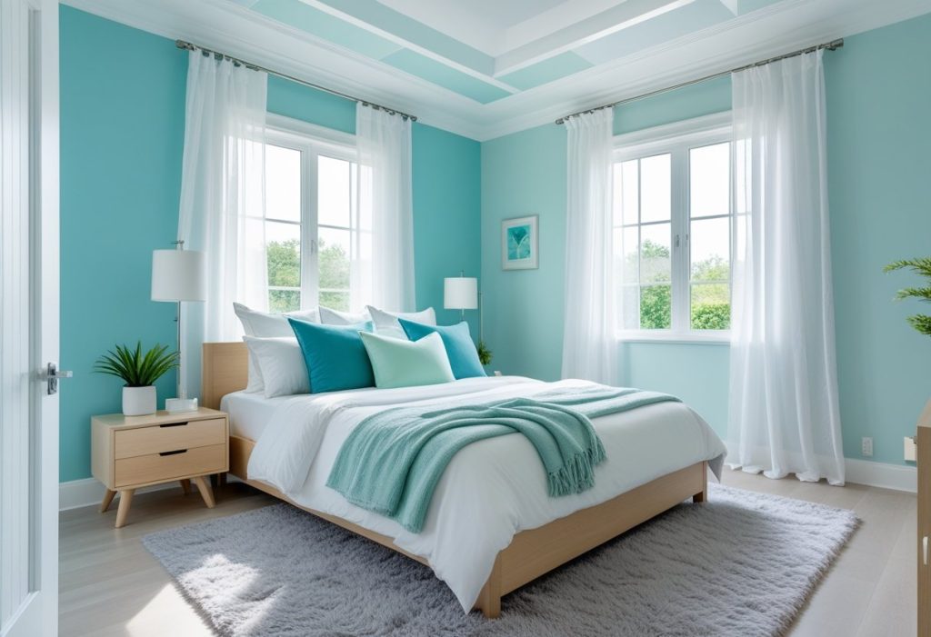
Blue and Turquoise Hues
Blue and turquoise tones are widely chosen for their calming effects and versatility. Blue ranges from soft sky shades to deep navy, offering options for both light, airy rooms and more dramatic looks.
Turquoise combines the peacefulness of blue with a touch of green, creating a refreshing and energizing feel. It works well in bedrooms where relaxation is key but a lively touch is desired.
These hues pair effectively with neutral shades like white, grey, or slate, making the color adaptable to different decor styles. Turquoise accents in pillows or artwork can bring vibrancy without overwhelming the room.
Lavender and Soft Purple Tones
Lavender and other soft purple tones provide a subtle warmth while maintaining cool undertones. Lavender promotes relaxation and is often used to enhance bedrooms intended for rest and tranquility.
Light purples can soften hard edges in modern furniture or add a gentle contrast to white linens and grey walls. These shades suit rooms with natural light, as they reflect brightness gently.
Lavender blends well with charcoal and slate greys, creating a sophisticated yet peaceful space. It appeals to those seeking an understated look that avoids the intensity of bolder purples.
Cool Colors in Modern Bedrooms
Modern bedrooms favor cool colors for their ability to combine minimalism with comfort. Slate and charcoal are common choices, delivering depth without overpowering the space.
Charcoal walls or accent pieces provide a neutral base that allows lighter cool tones, such as soft blues or lavender, to stand out. This approach helps maintain balance and prevents the room from feeling cold or sterile.
Using layers of cool shades with different textures—like matte paint, plush bedding, or woven rugs—adds dimension. Designers often recommend pairing dark cool tones with metallic or natural wood elements for contrast and warmth.
Styling Tips and Material Pairings

Choosing the right materials and coordinating elements enhances any bedroom color scheme. Thoughtful integration of textiles, furniture finishes, and accessories creates cohesion and depth. Attention to contrast, texture, and suitable materials ensures a balanced, inviting space.
Coordinating Bedding and Textiles
Bedding sets the tone for bedroom color schemes. Choosing linens that complement or contrast the wall color can enhance mood and style. For instance, crisp white or soft beige bedding pairs well with bold wall colors, creating a clean, calming effect.
Heavier textures like velvet or woven throws add warmth and tactile interest. Layering patterns—such as subtle stripes with solid colors—helps maintain visual balance without overwhelming the space. Pillows in complementary shades or with metallic accents can serve as focal points.
Using natural fabrics like cotton or linen improves comfort and breathability, which is critical for restful sleep. This combination works well whether the walls are painted in neutrals, pastels, or deep hues.
Natural Wood and Metal Finishes
Natural wood furniture introduces warmth and organic texture that grounds bedroom color schemes. Light woods such as oak or maple suit cooler palettes, while darker woods like walnut enrich richer hues and create contrast.
Metal finishes should be chosen with intention to complement the color story. Warm metals, such as brass or copper, work well with earth tones and deep colors. Cooler metals like brushed nickel or matte black suit modern, neutral, or pastel colors.
Mixing wood and metal in furniture and fixtures—like a wooden bed frame with metal legs or pendant lights—offers visual interest without clutter. It is important to maintain consistency in finish tones to avoid discordance.
Balancing Colors with Accessories
Accessories play a crucial role in balancing bedroom color schemes. Rugs, lampshades, and artwork can either accentuate or soften main colors. For example, a neutral rug tones down vibrant walls, while a patterned rug can introduce secondary colors and texture.
Artwork should echo the room’s palette or introduce an accent color for variety. Mirrors with metal or wooden frames reflect light and add dimensionality, enhancing both dark and light schemes.
Small accessories—such as vases, trays, or books—allow flexibility in updating color accents seasonally. Maintaining a limited color palette in accessories avoids visual clutter and ensures harmony throughout the space.


