Best Room Color Ideas for a Stylish Bedroom
Choosing the right color for a bedroom can significantly influence the room’s atmosphere and how it feels to spend time there. Whether the goal is to create a calming retreat or an energizing space, the colors selected set the overall tone and mood. The best bedroom color ideas balance personal preference with the effect colors have on relaxation and comfort.

Many prefer soothing neutrals or soft blues to promote restfulness, while others might opt for warmer hues like soft peach or muted gold to foster coziness. Some choose bold or dramatic shades to reflect personality without sacrificing tranquility. Understanding how different colors interact with light and space can help guide the choice to a palette that suits both style and function.
Incorporating a mix of tones can also add depth and interest, allowing a simple room to feel dynamic but still inviting. Bedroom color schemes can be a subtle influence on mood, making the room either a peaceful refuge or a vibrant, refreshing start to the day.
How Room Color Influences Bedroom Ambiance

Room color directly affects the feel and function of a bedroom. It shapes the sense of space, mood, and comfort, making careful color choice a key aspect of interior design. This influence is determined by mood impact, the warmth or coolness of tones, and the psychological effects of those colors.
The Impact of Bedroom Paint Colors on Mood
Bedroom paint colors have a measurable effect on emotions. Soft blues and greens are often chosen to promote calmness and relaxation, ideal for restful environments. In contrast, colors like reds or vibrant oranges can increase energy and stimulate alertness, which might not suit every bedroom.
The right color palette helps define the bedroom’s atmosphere, balancing warmth and coolness. Neutral shades, such as beige or gray, offer versatility and create tranquility without overwhelming the senses. Choosing colors based on personal preference aligned with desired emotional effects is critical for enhancing wellbeing.
Color Temperature: Warm vs Cool Tones
Warm tones include shades like reds, yellows, and warm browns. These evoke coziness and intimacy, making the space feel inviting, especially in larger or drafty bedrooms. Warm colors tend to visually reduce size, adding a sense of enclosure.
Cool tones, such as blue, green, and violet, expand the room’s perceived size and foster a peaceful ambiance. They are ideal in small or naturally warm bedrooms to balance heat and brightness. On the color wheel, warm and cool tones sit opposite but can be mixed to adjust mood subtly.
Choosing between warm and cool tones depends on lighting, room size, and furniture, ensuring the final interior design feels balanced and comfortable.
The Psychology of Bedroom Color Choices
Color psychology links bedroom colors to mental state and sleep quality. Soft, muted colors reduce stress and create a sanctuary conducive to rest. For example, pastel blues and lavenders can decrease heart rate and calm the mind.
Bold or highly saturated colors can produce strong psychological reactions, such as excitement or anxiety, if overused. Subtle undertones in neutral shades can affect mood as well, with warm undertones fostering comfort and cool undertones encouraging serenity.
Understanding personal reactions to colors and how they interact with the overall bedroom design leads to choices that enhance wellbeing and promote sleep health.
Popular Bedroom Color Ideas
A well-chosen paint color can define the atmosphere and character of a bedroom. Options range from subtle and calming tones to more distinctive colors, each influencing mood and style in specific ways.
Timeless Neutrals for a Classic Look
Neutrals remain a popular choice for bedrooms due to their versatility and ability to create a clean, timeless feel. Whites, beiges, and soft grays offer a flexible backdrop that complements various decor styles.
These colors work well in bedrooms aiming for a cozy yet elegant ambiance. They also make it easier to introduce accent colors through textiles and accessories like pillows, rugs, and curtains.
Neutrals often enhance natural light, making a room feel larger and more inviting. This makes them suitable for bedrooms with limited sunlight. Soft pink can also fit within this palette, adding a subtle warmth without overpowering the space.
Serene Blues for Relaxation
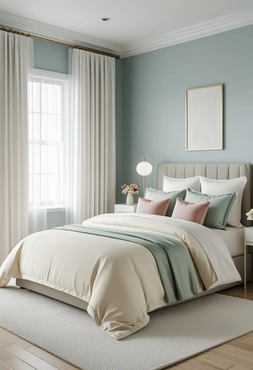
Blue bedroom paint color ideas often focus on calming shades that encourage rest and tranquility. Soft blues, dusty navy, and pastel shades provide a sense of peace and help lower stress.
Blue hues suit bedrooms designed as restful retreats. In particular, lighter blues open small spaces, while deeper shades add richness and personality. Blue pairs well with whites and other neutrals, ensuring balance and harmony.
This color is popular for those seeking a cool, airy bedroom that feels clean but inviting. Blue bedrooms frequently draw inspiration from natural elements like the sky and water, reinforcing the calming effect.
Soothing Greens for Tranquility
Soothing green shades are increasingly favored in bedroom paint color ideas for their ability to evoke nature and promote relaxation. Soft sage, muted olives, and pale greens create a restful and grounded atmosphere.
Green bedrooms are ideal for those who want a connection to the outdoors or a quieter, balanced environment. Green pairs well with warm neutrals and natural wood tones, enhancing a room’s organic feel.
This color is versatile enough to work in both modern and traditional bedrooms. It complements varied accent colors, allowing personalization without losing the tranquil mood that green naturally provides.
Bold and Unique Bedroom Color Schemes

Bold bedroom color schemes often rely on striking contrasts and rich hues that create a strong visual identity. These schemes can elevate a room’s atmosphere through thoughtful use of color palettes, accent walls, and carefully chosen tones. The goal is to inject personality without overwhelming the space.
Incorporating Jewel Tones
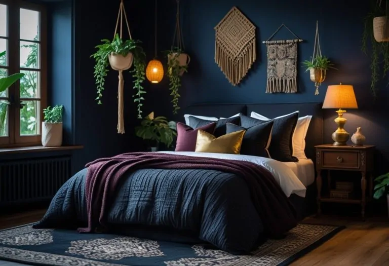
Jewel tones such as emerald green, sapphire blue, amethyst purple, and ruby red bring depth and luxury to a bedroom. These rich colors work well on walls, furniture, or textiles to create a sophisticated, layered look.
Using jewel tones as the dominant color in a room requires balance with neutrals like beige, gray, or off-white. This prevents the palette from feeling too dark or heavy. For example, an emerald-green wall paired with crisp white bedding allows the color to stand out without overpowering.
Accent pieces in jewel tones—like velvet cushions or a bold rug—can inject vibrancy without committing to full room coverage. This approach suits those who want a refined yet visually dynamic space.
Dramatic Accent Walls
An accent wall painted in a bold shade serves as the room’s focal point and defines the color palette. Deep colors like navy, charcoal, or burnt orange add dramatic flair without requiring the entire room to be painted.
Placement of the accent wall is critical. It often works best behind the bed or a major piece of furniture to anchor the space visually.
Pairing a dramatic accent wall with lighter or neutral surrounding walls enhances the effect and prevents the room from feeling enclosed. Textural finishes or matte paints can increase the wall’s visual impact.
Incorporating artwork or statement lighting on the accent wall emphasizes its role as a centerpiece within the room design.
Combining Contrasting Colors
Combining contrasting colors highlights boldness through visual tension. Popular combinations include blue and orange, mustard yellow and deep purple, or teal and coral.
When mixing contrasting colors, it’s important to define a consistent color palette with one color dominant and the other as an accent. This avoids visual chaos and maintains a cohesive look.
Using different intensities of contrasting colors—such as muted blue with bright orange—can soften the overall effect while keeping the design interesting.
Furniture, bedding, and décor are the ideal ways to introduce contrasting colors without risking overwhelming the space. Balanced contrast can energize the room and showcase personal style.
Choosing the Right Bedroom Paint

Selecting the ideal bedroom paint involves balancing color quality, finish, and testing methods to achieve the desired mood and durability. This process helps ensure the space feels both comfortable and visually appealing.
Selecting Paint Brands and Finishes
Benjamin Moore and Sherwin-Williams are popular for bedroom paint colors due to their extensive palettes and consistent quality. Choosing a reputable brand ensures better pigment and coverage, which affects how true the color appears on walls.
The finish impacts bedroom ambiance and maintenance. Matte and eggshell finishes soften light and hide imperfections, making them suitable for relaxing bedrooms. Satin finishes offer a slight sheen and durability, useful for walls exposed to more wear. Glossy finishes are generally avoided in bedrooms because they reflect too much light and feel less cozy.
Sample Testing and Moodboards
Testing paint samples on different walls at various times of day helps see how color changes with natural and artificial light. Applying large swatches allows better judgment of how the paint interacts with existing bedroom elements.
Creating a moodboard with fabric swatches, furniture photos, and paint chips aids clear visualization. It keeps choices cohesive and aligned with the intended bedroom atmosphere. Digital tools or physical boards work effectively for comparing shades and finishes before making a final decision.
Designing with Bedroom Color Palettes
The choice of a bedroom color palette influences every design element, from walls to furniture. Coordinating these elements thoughtfully helps create spaces that feel balanced and intentional. Focus on how accessories and textiles relate to paint colors for a unified look.
Creating a Cohesive Look with Accessories
Accessories serve as essential accents that either complement or enhance the bedroom’s main color palette. For example, if the walls are painted ivory, adding accessories in muted tones like soft grays, sage greens, or warm browns keeps the look subtle and refined.
Metallic or textured items such as brass lamps, woven baskets, or ceramic vases can add depth without overwhelming the room. Choosing accessories that echo tones found in the walls or furniture ensures harmony.
Grouping accessories by color or style can establish visual rhythm. Using repetition — like multiple pillows or art pieces in coordinating hues — strengthens the overall coherence in the room’s design.
Pairing Wall Colors with Textiles and Furniture
Textiles and furniture must relate to the wall color to maintain a consistent bedroom color palette. Neutral wall colors like ivory offer flexibility, allowing bolder textiles—such as deep blues or rich greens—to stand out without clashing.
Furniture in natural wood tones or muted finishes pairs well with soft wall colors, anchoring the space. If the walls are a darker or more saturated shade, lighter textiles can prevent the room from feeling closed in.
Consider the scale and pattern of textiles. Large patterns in similar colors to the walls keep a sense of calm, while high contrast fabrics introduce energy. Balance is key between wall color, bedding, and upholstery to ensure a cohesive design.
Tips for Personalizing Your Bedroom Color

Personalizing bedroom colors involves thoughtful choices that reflect individual style and adapt to changing preferences. Using seasonal adjustments and influences from current interior design trends can help maintain a fresh and appealing bedroom look.
Seasonal Color Updates
Adapting bedroom paint color ideas with the seasons can enhance mood and comfort. For spring and summer, lighter shades like soft blues, pale greens, or creamy whites create an airy, refreshing feeling.
In fall and winter, deeper tones such as warm grays, rich browns, or muted burgundies add coziness. Changing accent walls or using removable wallpaper are simple ways to shift colors without full repainting.
Seasonal updates also consider natural light variations. Brighter colors work well when daylight wanes, while cooler tones can cool a room during warmer months. This approach keeps the space feeling balanced year-round.
Inspiration from Trends and Interior Designers
Interior design trends offer a curated palette of bedroom paint color ideas that blend style with function. In 2025, popular selections emphasize mood-setting shades—calming neutrals, dramatic jewel tones, and earthy hues.
Designers often recommend mixing timeless colors with bold accents for personality. For example, pairing classic beige with a deep navy accent wall balances serenity and sophistication.
Professional tips also include considering texture and finish, such as matte for a soft look or satin for a bit of sheen. Choosing colors that complement bedroom furnishings and natural light enhances cohesion and comfort.